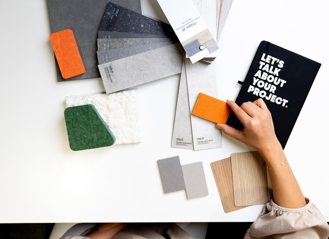
How to Choose the Right Colour Palette for a Timeless Interior
Choosing a colour palette that will look good year after year is less about following trends and more about making deliberate, practical decisions. A timeless scheme gives you flexibility to refresh with accessories, adapts to different lighting, and increases the lasting comfort and value of your home.
This guide breaks the process into clear, actionable steps: how to build a neutral foundation, introduce accents, use art and lighting to your advantage, and select materials that keep the look enduring. Each section includes tips you can apply room by room, plus a short checklist to use before you commit.
Principles of a Timeless Palette
Timeless colour schemes share a few characteristics: restraint, balance, and a relationship between warm and cool tones. Start by limiting your main palette to two or three base colours—one dominant, one supporting, and one accent—and then repeat them through furnishings and finishes. This simplifies decisions and prevents overloading the eye.
Start with a Neutral Foundation
Neutral does not mean boring. Soft greys, warm beiges, off-whites and muted greiges create a calm backdrop that lets furniture and decor stand out. Walls, large rugs and major upholstery pieces benefit from neutral tones because they are harder to grow tired of.
For quick, low-cost updates that keep the room cohesive while you refine your palette, use textile swaps such as Cushion Covers. Changing cushion covers is an effective way to test accent colours against your neutral base before committing to paint or upholstery.
Choose a Limited Accent Palette
Pick one or two accent colours and use them consistently. Accent colours should be stronger or deeper than your base and used sparingly—on cushions, a throw, a feature wall, or small furniture pieces. This restraint is what keeps the scheme elegant and timeless.
Decorative accessories are where accents do most of the work. Mixing patterns and tones is safer when those accents are modular: consider swapping or layering Decorative Cushions in different textures and sizes to see which hues endure visually as natural light changes through the day.
Anchor the Room with Art and Mirrors
Artwork and mirrors set the emotional tone and scale of a room. A large print or gallery wall can introduce secondary colours and patterns without overwhelming the space. Mirrors broaden light and can alter perceived colour saturation—helpful if you want softer or brighter results.
Choose pieces that echo your palette and repeat key tones from other elements. Look at the overall colour balance rather than a single focal piece: if the artwork contains a small pop of your accent colour, the rest of the room should pick up that tone in softer ways via textiles or ceramics. If you need starting points, browse curated selections like Wall Art & Prints and add reflective depth with Decorative Mirrors.
Select Timeless Materials and Finishes
Colour is perceived differently depending on material. Matte paint, satin wood finish, glossy ceramic and textured textiles each interact with light uniquely. Natural finishes—wood, stone, linen, and brushed metals—tend to age gracefully and pair well with neutral palettes.
Use sculptural objects and subtle colour repeats to tie finishes together. A few well-chosen vases or trays that echo your accent colour will keep cohesion without clutter. Consider introducing a handful of pieces from complementary ranges such as Decorative Vases to coordinate across surfaces and shelving.
Lighting: Colour Temperature and Mood
Lighting dramatically alters how paint and fabrics read. Cool light (higher Kelvin) will make colours appear crisper and slightly bluish; warm light (lower Kelvin) brings warmth and depth. Layered lighting—ambient, task, and accent—lets you fine-tune the mood throughout the day.
Installing flexible solutions such as dimmable, colour-adjustable bulbs helps you preview how different temperatures affect your palette in real time. If you plan to adjust lighting for mood or seasons, consider integrating Smart Light Bulbs so you can test and lock in the desired atmosphere without rewiring.
Layer Texture and Practical Accents
Texture prevents a neutral palette from feeling flat. Mix smooth leathers with nubby wools, woven rugs with metallic accents, and matte ceramics with glossy frames. These tactile contrasts carry visual interest without relying on loud colour shifts.
Practical decorative elements also keep a room timeless: choose durable throws, tasteful frames, and lasting accessories that complement the palette. For quick seasonal swaps or to test a new accent, keep a small assortment of soft furnishings like Throws & Blankets and curated tabletop pieces such as Photo Frames on hand to refresh the look without major expense.
Practical Planning and Sampling
Before painting an entire room, test at least two paint chips on different walls and observe them at morning, midday, and evening. Bring fabric swatches next to these test patches to ensure they harmonise. Remember to account for fixed elements (flooring, cabinetry) as they limit the palette options.
Small Checklist
- Establish dominant neutral, supporting tone, and one accent.
- Test paint chips on multiple walls and in different light.
- Use removable accessories (cushion covers, throws) to trial accent colours.
- Layer textures to add depth without more colour.
- Confirm finishes and materials look cohesive together.
- Try dimmable or adjustable lighting before finalising paint.
FAQ
- How many colours should I use in one room? Limit to three main tones: a dominant neutral, a supporting hue, and one accent. Use varying textures and finishes to increase variety without more colour.
- Can I use strong colours and still be timeless? Yes—used as accents and balanced with neutral backgrounds, strong colours can feel refined rather than trendy.
- What if natural light changes the paint colour? Sample paint in different light conditions and at different times of day. Use adjustable lighting like Smart Light Bulbs to preview evening tones before committing.
- How do textiles affect my palette? Textiles can deepen or soften colours. Swap cushion covers and throws seasonally to refresh accents without repainting; cushions and throws are practical testing tools.
- Should artwork match my palette exactly? Artwork should echo key tones rather than match exactly. Pieces that contain a small element of your accent colour help unify the room while keeping interest.
Conclusion
Creating a timeless interior palette is a process of subtraction and testing: reduce the number of main colours, choose quality materials, layer texture, and test options in real light. Start neutral, commit to a restrained accent plan, and use durable accessories to fine-tune the look. Your most practical next step is to collect sample textiles and test them against painted swatches under both natural and adjustable lighting to confirm the palette will stand the test of time.